Sometimes, it is just fun to do some simple math and get nice figure, why not drawing some bifurcation diagrams.
How it works
To draw a bifurcation diagram, we need to find some recurrence relation that exhibits chaotic behaviour. A nice place to find them is to use Euler method for specific dynamic system such as logistic systems.
For this specific recurrence:
![\[x_{n+1} = r x_n (1 - x_n)\]](https://landercy.be/wp-content/ql-cache/quicklatex.com-d11d7f89f065a9c2d365fd34b0c86bde_l3.png "Rendered by QuickLaTeX.com")
Where  is our parameter and
  will be some initial condition, there are multiple different behaviour (we may want to discard some few first points) for the series: stability, multiple equilibrium points and chaos.
We can implement the recurrence function as follow:
def model(x, r):
    return r * x * (1. - x)
And we create a function that compute the  first terms and may keep only the
  last terms:
def diagram(r, x=0.1, n=1200, m=200):
    if not isinstance(x, np.ndarray):
        x = np.full(r.size, x)
    xs = []
    for i in range(n):
        if i >= n - m:
            xs.append(x)
        x = model(x, r)
    return np.array(xs).T
Now we can compute the 30 first terms of the recurrence relation for several values of parameter to see what are the behaviour of the generated series:
rtest = np.array([0., 0.5, 1.5, 3.0, 3.1, 3.5, 4.0])
xtest = diagram(rtest, n=30, m=30)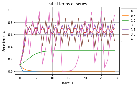
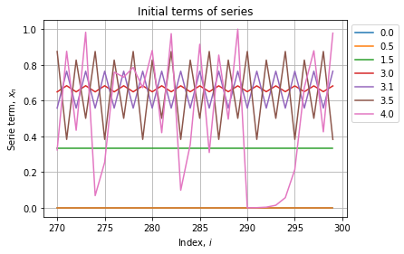
As expected all series starts at 0.1, some converges to a constant other oscillate between two or more specific values. We can see further to check if the behaviour stabilizes:
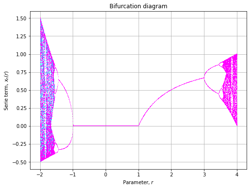
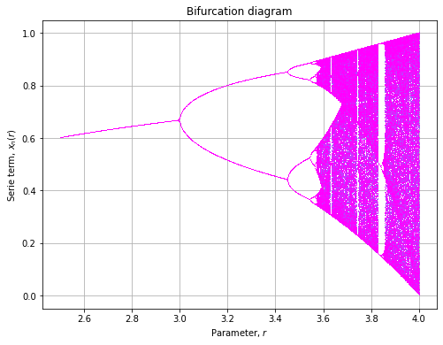
Now instead of plotting last series terms wrt to their index, we will assess them wrt the parameter . We also will test multiple values of initial conditions and assign them different colors.
rlin = np.linspace(-2, 4, 500)
xlin = np.linspace(-0.1, 0.1, 2)
clin = np.linspace(0., 1., xlin.size)
colors = plt.get_cmap("cool")(clin)
The bifurcation diagram will then we plotted as follow:
fig, axe = plt.subplots(figsize=(8, 6))
for x0, color in zip(xlin, colors):
    x = diagram(rlin, x=x0, n=600, m=100)
    axe.plot(rlin, x, ',', color=color)
axe.set_title("Bifurcation diagram")
axe.set_xlabel("Parameter, ")
axe.set_ylabel("Serie term, ")
axe.grid()
")
axe.grid()And renders as:
Examples
Lets plot more of them with this all on one plotting function:
def plot(model, rlin=None, xlin=None, colors=None, n=1200, m=200, rmin=-20, rmax=20, rsize=1000, cmap="cool", axe=None):

    if rlin is None:
        rlin = np.linspace(rmin, rmax, rsize)

    if xlin is None:
        xlin = np.linspace(-0.5, 0.5, 10)

    if colors is None:
        clin = np.linspace(0., 1., xlin.size)
        colors = plt.get_cmap(cmap)(clin)

    if axe is None:
        fig, axe = plt.subplots(figsize=(8, 6))

    for x0, color in zip(xlin, colors):
        x = diagram(model, rlin, x=x0, n=600, m=100)
        axe.plot(rlin, x, ',', color=color)

    axe.set_title("Bifurcation diagram")
    axe.set_xlabel("Parameter, ")
    axe.set_ylabel("Serie term, ")
    axe.grid()

    return axe
Biological system
![\[x_{n+1} = B \tanh (\omega_2 x_n) - A \tanh (\omega_1 x_n)\]](https://landercy.be/wp-content/ql-cache/quicklatex.com-f65825afa587a6dbccc89e045bd695e0_l3.png "Rendered by QuickLaTeX.com")
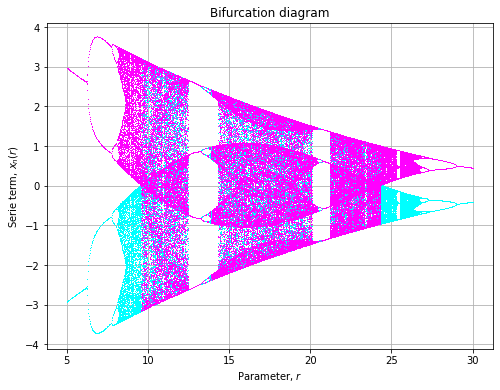
def sigmoid(x, r):
    return 5.821 * np.tanh(1.487 * x) - r * np.tanh(0.2223 * x)

axe = plot(
    model=sigmoid,
    rmin=5, rmax=30,
    xlin=np.array([-0.1, 0.1])
)
Sinusoidal
![\[x_{n+1} = r x_n^2 \sin(\pi x_n) + p\]](https://landercy.be/wp-content/ql-cache/quicklatex.com-f0fb63175d885a6ca4176cd2c975a108_l3.png "Rendered by QuickLaTeX.com")
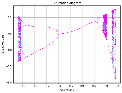
def sinusuodal(x, r, p=0.7):
    return r * x ** 2 * np.sin(np.pi * x) + p

axe = plot(
    model=sinusuodal,
    rmin=-2.7, rmax=1.4,
    xlin=np.array([-0.1, 0.1])
)
Cosinusoidal
![\[x_{n+1} = r x_n^2 \cos(\pi x_n) + p\]](https://landercy.be/wp-content/ql-cache/quicklatex.com-2505877c86dd60cf3fc97d03405fccd2_l3.png "Rendered by QuickLaTeX.com")
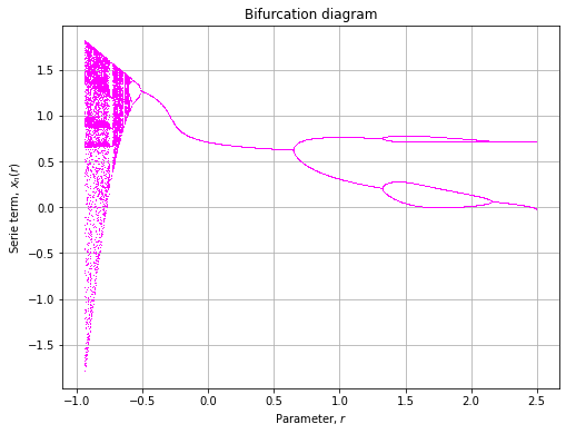
def cosinusuodal(x, r, p=0.7):
    return r * x ** 2 * np.cos(np.pi * x) + p

axe = plot(
    model=cosinusuodal,
    rmin=-1, rmax=2.5,
    xlin=np.array([-0.1, 0.1])
)