In this post we propose a simple implementation of Q-Q Plot and show some basic usage of it.
Implementation
A clean definition of a Q-Q Plot is:
In statistics, a Q–Q plot (quantile–quantile plot) is a probability plot, a graphical method for comparing two probability distributions by plotting their quantiles against each other
Wikipedia
Usually Q-Q plot compares a theoretical distribution/law with an experimental dataset. The procedure is then:
- Compute the ECDF of dataset to get empirical quantiles;
- Chose a theoretical model, you may fit against your data (eg. using MLE);
- Compute theoretical quantiles using quantile function (or PPF) from you theoretical model;
- Create pair of quantiles (theoretical, empirical).
If the Q-Q points lie on the  line, distribution perfectly agrees. If there are deviation it informs in which direction, so we can infer the behaviour.
The following snippet implement such a procedure:
def qqplot(data, law_factory, axe=None):

    if axe is None:
        fig, axe = plt.subplots()

    # Compute ECDF from data:
    ecdf = stats.ecdf(data)

    # Check if law is already parametered:
    if isinstance(law_factory, stats._distn_infrastructure.rv_continuous_frozen):
        law = law_factory
    # Fit using MLE if not the case:
    else:
        parameters = law_factory.fit(data)
        law = law_factory(*parameters)

    # Compute theoretical quantiles:
    quantiles = law.ppf(ecdf.cdf.probabilities)

    axe.scatter(quantiles, ecdf.cdf.quantiles, marker=".")
    axe.plot(quantiles, quantiles, "--", color="black")
    axe.set_title("Q-Q Plot: %s\n args=%s, kwargs=%s" % (law.dist.name, np.array(law.args), law.kwds))
    axe.set_xlabel("Theoretical Quantile")
    axe.set_ylabel("Empirical Quantile")
    axe.grid()

    return axe, law
The function can receive either a generic random variable or a parameterized one.
Usage
Lets draw some sample from a Chi Square distribution:
np.random.seed(12345)
law = stats.chi2(df=30)
data = law.rvs(size=30_000)
Now lets compare it with respect to a Gaussian:
axe, law1 = qqplot(data, stats.norm)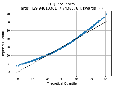
We see that central values agrees with theoretical quantiles but left and right tails deviate.
If we compare it with a generic Chi Square distribution:
axe, law2 = qqplot(data, stats.chi2)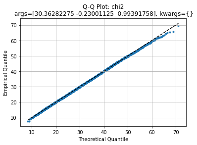
We get an almost straight line, indicating the model may suit for this dataset. Comparing with the original distribution:
axe, law2 = qqplot(data, law)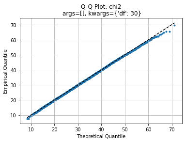
The agreement is identical. Challenging against a Log Normal we have:
axe, law2 = qqplot(data, stats.lognorm)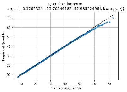
Which quite agrees as well but with a slightly fatter right tail.
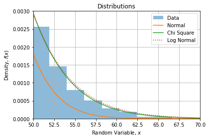
Comparison
If we compare CDF’s with data histogram, we find the same observations:
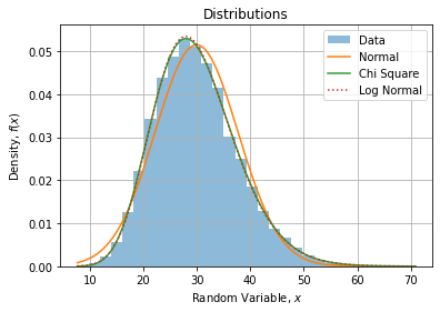
If we zoom on the right tail, we can confirm Log Normal is a bit fatter than Chi Square: