This post explains how to drawn the exact equation of the locus of maximum rates for an exothermic reversible reaction.
Model
We define the simple following reaction:
![\[A \underset{k_{inv}}{\overset{k}{\rightleftharpoons}} B\]](https://landercy.be/wp-content/ql-cache/quicklatex.com-f1fe3a15b108e4f408538c19731dba70_l3.png "Rendered by QuickLaTeX.com")
With rate  is defined as:
![\[v = k A - k_{inv}B\]](https://landercy.be/wp-content/ql-cache/quicklatex.com-1cfc9045161a80017a805b4c298ccf23_l3.png "Rendered by QuickLaTeX.com")
Where the thermodynamic and kinetic constants  and
and  are modeled as:
![\[K(T) = K_0 \exp\left( - \frac{\Delta_RH^0}{RT} \right) \,,\quad k(T) = k_0 \exp\left( - \frac{E_a}{RT} \right)\]](https://landercy.be/wp-content/ql-cache/quicklatex.com-2e01c282cd851f7b392f9bd77f6a09c7_l3.png "Rendered by QuickLaTeX.com")
Defining the conversion ratio  , concentrations can be expressed as
  assuming there is no product B at the beginning. Then we can state:
![\[K(T) = \frac{B}{A} = \frac{x_e(T)}{1 - x_e(T)} \Leftrightarrow x_e(T) = \frac{K(T)}{1 + K(T)}\]](https://landercy.be/wp-content/ql-cache/quicklatex.com-a1d5dbb7dd8345b5e4f18ca5095b60f6_l3.png "Rendered by QuickLaTeX.com")
Where  is the equilibrium conversion ratio for a given temperature
  . This equation is the envelope of all other curves as it is impossible to go beyond the equilibrium.
Similarly, reaction rate can be written in term of :
![\[v = k(T) A_0 (1-x) - \frac{k(T)}{K(T)} A_0 x = A_0 k(T) \left[ 1 - \frac{x}{x_e(T)} \right]\]](https://landercy.be/wp-content/ql-cache/quicklatex.com-50311b19d3343eb9c4a913809ef058e5_l3.png "Rendered by QuickLaTeX.com")
And isolate for a given rate :
![\[x(T, v) = x_e(T) \left[ 1 - \frac{v}{A_0 k(T)} \right]\]](https://landercy.be/wp-content/ql-cache/quicklatex.com-a99c2e41ce1fe2f01565dd6816a165a1_l3.png "Rendered by QuickLaTeX.com")
For an exothermic equilibrium those curves are concave (negative convexity) and therefore exhibits maximum. Putting  and solving for , we get the following expression:
![\[x_{otp}(T) = \frac{E_a K(T)}{E_a - \Delta_RH^0 + E_a K(T)}\]](https://landercy.be/wp-content/ql-cache/quicklatex.com-a3ae60ae134757b35527e6372c2d621a_l3.png "Rendered by QuickLaTeX.com")
Which is the locus of maximum rates (optimal temperature pathway) for the given reaction.
Symbolic check
We can check out the math using sympy:
import sympy as sp

R = sp.Symbol("R", positive=True)
T = sp.Symbol("T", positive=True)
DrH = sp.Symbol("\Delta_{R}H^0")
x = sp.Symbol("x", postive=True)
xe = sp.Symbol("x_e")
K0 = sp.Symbol("K_0")
Ea = sp.Symbol("E_a")
k0 = sp.Symbol("k_0")
A0 = sp.Symbol("A_0")
v = sp.Symbol("v")

KT = K0 * sp.exp(- DrH / (R * T))
xe = KT / (1 + KT)
kT = k0 * sp.exp(- Ea / (R * T))
vT = A0 * kT * (1 - x / xe)
xTv = xe * (1 - v / (A0 * kT))

sol = sp.solve(sp.Eq(sp.diff(xTv, T), 0), v)
sol2 = sp.solve(sp.Eq(sol[0], vT), x)
# [E_a*K_0/(E_a*K_0 + E_a*exp(\Delta_{R}H^0/(R*T)) - \Delta_{R}H^0*exp(\Delta_{R}H^0/(R*T)))]
Which is same expression that we derived above.
Numerical example
Lets write a small class that brings the math:
import numpy as np
import matplotlib.pyplot as plt

class Equilibrium:

    R = 8.314

    def __init__(self, DrH0, K0, Ea, k0, A0=1.):
        self.DrH0 = DrH0
        self.K0 = K0
        self.Ea = Ea
        self.k0 = k0
        self.A0 = A0

    def K(self, T):
        return self.K0 * np.exp(- self.DrH0 / (self.R * T))

    def xe(self, T):
        return self.K(T) / (1. + self.K(T))

    def k(self, T):
        return self.k0 * np.exp(- self.Ea / (self.R * T))

    def v(self, T, x):
        return self.A0 * self.k(T) * (1. - x / self.xe(T))

    def x_otp(self, T):
        return self.Ea * self.K(T) / (self.Ea - self.DrH0 + self.Ea * self.K(T))
And create a real world example:
model = Equilibrium(-75300, 0.18955e-10, 48721, 530991)

Tlin = np.linspace(250, 500, 500)

vlevels = np.logspace(-6, -1, 15)
xlin = np.linspace(0., 1., 500)
T, X = np.meshgrid(Tlin, xlin)
xisov = model.v(T, X)

fig, axe = plt.subplots()
c = axe.contour(T, X, xisov, vlevels)
axe.plot(Tlin, model.xe(Tlin), linewidth=2.)
axe.plot(Tlin, model.x_otp(Tlin))
Which renders as follow:
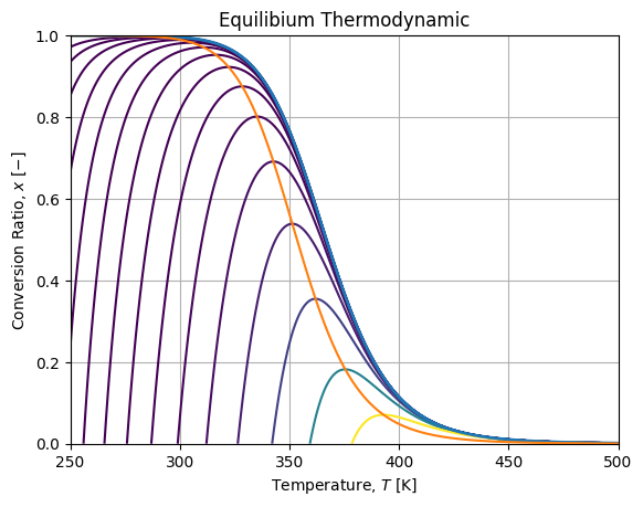
Where the blue curve is the equilibrium envelope, the orange curve is the locus of maximum rates.
